


Project Brief
Create a "mobile-first" marketing landing page promoting new and exclusive app features. To raise brand awareness and drive downloads of the app.
Roles & Responsibilities:
Sketch out the initial wireframes and figure out the interactive, scroll based user experience. Create a brand look and feel that centered around the app and its features.

Phase 1
Research & Ideation
Brainstorming and creative sessions around this project were held with all members of our team, including developers. Having the engineering team around was extremely valuable, because they provided a realistic outlook on what was technically possible while on a super short deadline.
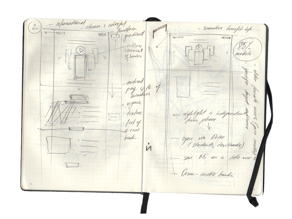
While thinking about the overall concept of the page, we kept in mind the immersive joy one gets while reading. Reading is a very personal, almost intimate experience, that pulls you into each line of the page.
Our idea was to create an elegant page that highlighted cool new features that the app provided their readers with, that was optimized for both web and especially mobile experiences. We were inspired by Apple’s marketing pages of putting the product forward, bold imagery, smooth transitions and animations.
Below are some early sketch explorations and wireframes.


Phase 2
Wireframes
The biggest desire for our team, was for the page to come alive with each swipe. We wanted to highlight all the fun features the app had to offer, with subtle animations and bold product shots.
Below is an example of a bubble up feature that made comic book strips come to life with animated and dynamic speech bubbles that pulled the reader deeper into the story.
The very first exploration had a dynamic gradient that would progressively get darker the farther you’d scroll, eventually displaying a deep blue, star filled background, highlighting a night light feature. As you scroll the phone would rotate slightly, eventually turning to its side to showcase more exciting features.
As we dug in deeper into our explorations, we experimented with backgrounds that would change dynamically based on the scroll portion and feature in view.
Several concepts and reviews later, one more major feature was added to the experience that yielded its own scroll based experience. The entire structure of the site had to be redone and improved on. With that came a fresh new look that was clean and minimal.


Phase 3
Visual Design
New feature brought new creative assets to work with. Lifestyle photography was a huge selling point and communicated different ways of engaging with the app and using it in all possible settings. The diagonal line opened and closed with each scroll, replacing the creative asset inside, the same animation persisted across the entire site experience on both mobile and web experiences.


Phase 4
Testing & Implementation
Both experiences were thoroughly tested and optimized across several platforms, web browsers, mobile phones and computer screens.
Final Experience
Below are the examples of our work in action.

